4 Tips to Make Your Mobile Website Load Quicker
If you have read any of the previous blog posts on our website you will probably see a common theme (other than the topic of SEO!). And this theme is MOBILE!
You should already know by now that mobile is a big deal, especially in terms of SEO. Businesses can no longer sit back and ignore the growing force that is mobile. It is a digital world out there and mobile makes up a sizeable chunk.

If you aren’t too convinced on the true power of mobile, then let me hit you with this fact:
There is no slowing down the force that is mobile and there is no doubt that this will continue to grow for many years to come.
But why is this? Why are more people using their mobile phones compared to their desktop?
Well there are a few reasons:
- Easy and quick access – mobile phone is portable
- Time killer – when waiting or on a train etc.
- Variety of activities – can make/ receive calls and texts, send emails, play games etc.
On top of this, Google announced TWO YEARS AGO that there are more search enquires on mobile than on a desktop computer! This is understandable seeing though more people are using mobile phones in general.
Mobile power has been around for a while now, and if you aren’t on board, it’s time to change your way of thinking. If not, you are quite likely going to be left behind. Make sure you aren’t left behind! Make the necessary changes to your mobile website (or even set one up!).

When designing your mobile friendly website it is important to follow proven tips and hints to make your website the best it can be. “What are these tips and hints?”, I hear you ask! Well if you are curious, have a read of a previous blog I wrote laying out all the best tips and hints for creating a mobile friendly website.
There are lots of different things you need to do for your mobile website. There are many aspects of your mobile website that can negatively impact your business. However, the focus of this blog (as you may have guessed from the title) is the silent killer of mobile speed!
Remember when I listed “easy and quick access” as one of the reasons more and more people are using their mobile phones? Well, if you aren’t delivering your consumers the need for speed they require on your mobile website, they are very likely to leave.
Just how likely are they to leave? Well about 50/50! Kissmetrics explains that more than 40% of users leave a mobile website if it doesn’t download in 3 seconds. Yep, 3 seconds! That just shows how short users attention span is becoming, as well as emphasises how important the factor of speed is for your mobile website.
To add salt in the wound, one of Google many ranking factors is speed! So if your website isn’t fast then you aren’t going to receive a good ranking from Google.
Don’t fret if your mobile website is slow (or even if you don’t know the speed)! There are many steps you can take to ensure your website is as fast as required.
1. Check Your Speed

The first step is to check the speed of your website. Even if you already have checked, it is important to check again. Having the most up-to-date information is essential when making the necessary changes to your website.
There are obviously many impacts for speed on your website and it is quite likely that the actual speed may surprise you. In order to work out what you are doing wrong (or right), you will need to check the speed.
If you are wondering how exactly do you check the speed, well there are a lot of different tools out there that are quite helpful and go into more detail than simply providing the actual speed.
The one I found to be the best and provides great detail is Think With Google. This checks the speed on both your desktop and mobile. While the speed of both is important, for the purposes of this blog we are only focusing on the mobile speed.
Once you have entered your URL into the website you will be given an outline of your speed. This is the results for when Google’s URL is entered:

Obviously Google is perfect at everything (and this is a tool by Google) so there shouldn’t be any surprises that they score 100/100 for mobile friendliness, mobile speed and desktop speed. What I love about the tool is that you have the option to receive a report. This will give you more vital information about what you could do to improve.
The report is free! All you have to do is input your email address and the report will be sent to you within the hour. This is what a snippet of the report looks like:
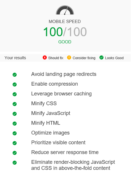
The tool lists many ways that you can fix the speed of your website. Some of which can be quite easy fixes, others will take some time.
2. Unnecessary Features
It’s nice to have all the bells and whistles on your mobile website.
But there is always the concept of taking it too far. If you include too many design features, this could certainly be slowing down the load time.
This is why it is important to limit the amount of features you include. I’m not saying don’t have any features (because this then will impact your conversions etc. negatively). I’m talking about ensuring you don’t go over the top.
It is quite easy to become engrossed in the element of design and you somehow end up with one of everything on your website. When it comes to design and the speed of your website, restraint is key.
If you end up with too many design features, your website is likely to develop a terrible condition called “code bloat”. This is where your website’s speed is dragged down by excess code.
When does code bloating usually occur? Well this is when a web designer primary focus is on what the website looks like (and not the performance). How a website looks is certainly important, but you should never compromise looks for performance.
Lucky for you, there are a variety of different ways you make your website look good as well as keep a high level of performance. Your website doesn’t need to have complex design features to attract users. In fact, these days users are veering towards more simple designs that allow them to find what they are looking for and fast!
Design is especially important when it comes to mobiles. This is because there is a much smaller screen. If your website is filled with design features and all those features are squished into a tiny little mobile screen it is likely to confusing and irritate the user. Having a simple and de-cluttered webpage is essential.
If you are in need of some specific changes you can make to your mobile site to ensure performance, look no further!
Call to Action
Firstly, you should probably only have one call to action button per page. Call to actions usually take up a lot of code and too many can lead to code bloating.
Purchase Process
Another way is to reduce the amount of steps it takes to get the consumers business. For example, don’t make the consumer go through unnecessary pages to get to the check out where they can finally purchase their item. Most businesses can make the purchase process for their consumers in just 3 or 4 steps.
Images
Using less images and optimising the ones you do include is also important to ensure a fast website. Including images on your website is a must. It allows for you to break up the text and give users’ eyes a rest. However, use too many images at your own risk.
Too many images with a high resolution will certainly slow down your website. SOASTA confirms that images make up over 60% of your website’s “weight”. So make sure you think twice before including the 142th photo for that page!
As well as using fewer images, you can also compress the size of files.
When you compress an image file, you are making the picture smaller while not ruining the quality.
A great site to use that will compress your picture files in a snap is Compressor. Using this tool there is almost no difference between the before and after quality of your photograph!
Fonts
Specifically, custom fonts. Everyone likes custom fonts; they add an extra bit of flair to your website. However, they take up a lot of space in terms of code. Some fonts use ridiculous amounts of JavaScript or CSS. It is recommended that you only use custom fonts if essential (i.e. a heading or call to action button).
3. Above the Fold
Here it is important to ensure that all the content that is above the fold loads before any other content. Above the fold is simple, it refers to everything a user can see on your website before they have to scroll down.
It is pretty self-explanatory why you would what the above the fold content to load before anything else. But I’m going to spell it out for you. If the above the fold content loads first and fast, this will distract the users for (hopefully) long enough while the rest of your website downloads!
Let’s look back to the screenshot of the speed report from Think With Google. One of the factors in there is “prioritize visible content”.

This means that if you don’t code your webpages to load your above the fold data first, you won’t see a perfect score from Google. The more you impress Google, the greater the chances you’ll have a higher ranking!
4. Redirects
Redirects are great and they help boost user experience and your SEO. However, as with many aspects mentioned in this blog post, use redirects sparingly. In other words, don’t go overboard! If you use too many redirects your website will not be performing at its highest capacity.
When you include redirects the server has to work harder (therefore taking more time) to locate and load the desired information. The process happens with every single file on a webpage. So you can see how this will slow down your website.
If you are unsure about the amount of redirects you have on your website, give Varvy’s Redirect Mapper a try! All you have to do is input your URL and the results will be displayed.
 The screenshot above shows the results from Facebook. By using this tool you can easily see where any potential redirection problems lie.
Summary
Mobile is important. You can no longer deny it. If you aren’t on board the mobile train then you are certainly one of the few. Even think about your own mobile usage.
Has it increased in the last couple of years? Probably.
Do you use your mobile just as much as a desktop? Again, probably.
With the power that mobile holds, it is important that you take the time to create a website that is mobile friendly, this includes (most importantly) speed! A fast website is essential to both keeping users happy and to maintain a high ranking on Google.
When looking at the issue of speed in terms of your mobile website, you need to first actually find out the speed! By using the fabulous tool that is Think With Google, you can do this!
After you have a better understanding of your actual speed there are other tips on offer to ensure your website loads faster. By reducing the amount of unnecessary features (i.e. less call to action buttons, reducing the purchase process, limiting the amount of images and custom fonts) you will be gaining so much needed speed.
As well as this you should also look to format your website so it loads the content above the fold first. This gives the rest of the content some extra time to load. Finally, the by reducing the amount of redirects on your webpage, you will again pick up some extra speed!

Read ➡ Reasons Your Website Deserves To Receive A Penalty From Google

We are a friendly and reliable team that pays detailed attention to your projects and management of your brand. Our team at SEO Shark has a passion for all things online. We constantly innovate using the latest professional techniques and strategies.

