Tips to Pick the Best Colour Scheme for your Website
Colour is important. It is probably a lot more important than you think. Do not underestimate the power and influence colour has over your consumers. You may think a colour is just a colour, but you will be surprised how a colour can completely change the mood and send a different message.
To help solidify my statement of “colour is important”, let me hit you with this stat:
Kissmetrics found that “85 % of shoppers base their product purchasing decision on colour.”
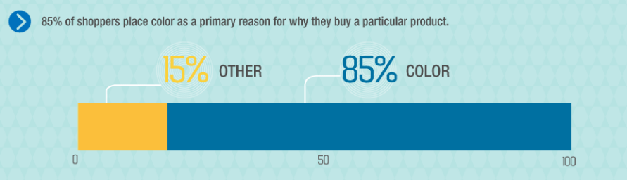
Image Credit: Kissmetrics
You may think that the statistic is somehow wrong and that’s to high of a number. But think about it. As humans we are very visually dependant. If something looks nice we are naturally drawn to it. We are essentially guided by what we think looks good.
As well as this, we associate colour with certain feelings and emotions. If you are a big enough brand with significant amounts of influence, people could tend to associate colours with your brand.
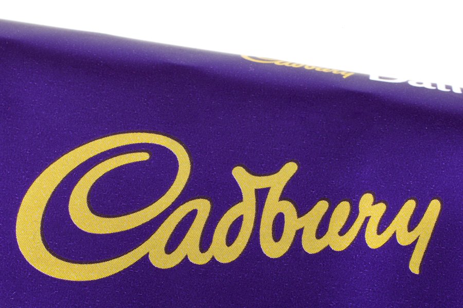
For example, when you think of Cadbury chocolate you probably think of that purple colour. Well this is what Cadbury wants. They want that purple colour to be associated with their brand, so much so that in 2012 they actually won a trademark battle to copyright specific purple colour. Now no one else has the legal right to use that colour!
A lot of well established brands introduce distinct and well known colour schemes. For example, McDonalds red and yellow logo.
When a brand has a distinctive colour scheme it assists in establishing their brand identity.
And who is going to forget those golden arches? Probably no one!
It is important to think about your logo, or any other places where you have used colours and identity for your brand. Here you should look to establish continuity by keeping your website colour scheme the same as your logo.
By keeping these two similar, it further cements the colours in your consumers’ minds. It helps to further build the association between a particular colour and your brand. This is supported by research conducted by Kissmetrics where they explain “colour increases brand recognition by 80%”.
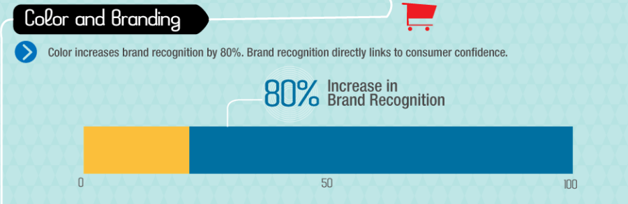
Image Credit: Kissmetrics
So you want your brand to be easily recognised? Make sure it’s got a good colour scheme!
What’s more? There is a direct correlation between brand colour and brand value. Forbes explains the percentage of the most 100 valuable businesses and the colour they use for their logo:
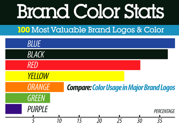
Image Credit: Forbes
So you can clearly see that blue and black take the cake! If you want your brand to make the most valuable business list in 2017 make sure you have a blue or black logo. Well, it doesn’t really work like that, but you get where I’m going!
Valuable brands care about the colours they use and work hard to ensure they are conveying the right message. Think about your own brand and what it stands for and then you can effectively use colours to express this.
When it comes to your website colour scheme, don’t just throw some colours on or choose whatever looks nice. Colour is important, so make sure you take the time to choose the right colours.
Users tend to make a snap judgement about your website. You don’t want to give off the wrong impression by choosing incorrect colours. It is also important to think about your target market, what colours would they be naturally drawn to. I can tell you right now that a 50 year old man would be drawn to different colours than that of a 13 year old girl.
That’s enough talking, now let’s get into the nitty gritty! Here are the top 9 tips to pick the best colour scheme for your website:
1. Target Market

I talked about this briefly above. You need to establish what your overall targeted demographic is. Your chosen demographic will influence your choice of colour scheme. This is because different demographics tend to like different colours. You probably wouldn’t have a hot pink website if you were looking to target a middle aged man.
On top of this, think about the type of emotion you want your target market to feel. Do you want them to be happy, excited, warm, trusting, bold, etc.?
If you would like more information about psychology and emotions based off colours you should have a look at Fast Company’s website. They go into detail about each colour and what personality/ emotions, marketing and politics are associated with it. As well as listing the major brands you would find associated with that colour.
2. Colour Impacts Emotion
I have talked about how colour impacts emotion. Different colours evoke different emotions. By choosing a particular colour you are sending a subconscious message to your consumers about what your brand stands for.
This means you don’t have to specifically say, for example, that your brand creates happiness and optimism, you could just put the colour yellow in your website.
Kissmetrics lists all the major colours and what emotions they evoke:
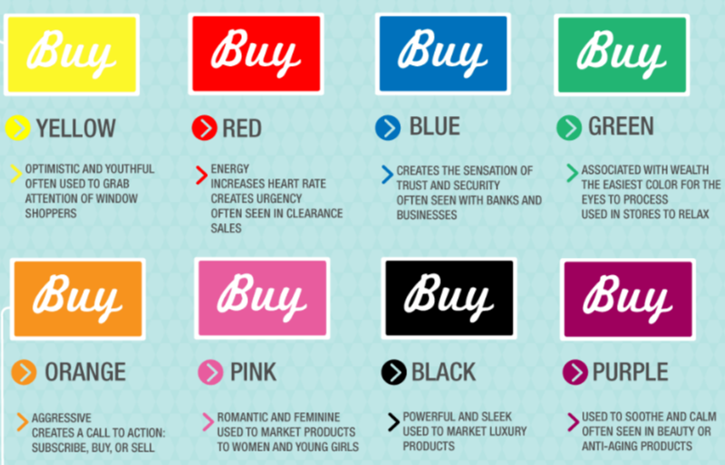
Image Credit: Kissmetrics
Something that could also be of great use to you is the Colour Emotion Guide from Entrepreneur I found. I personally think it’s a great way to showcase all the major brands and the colours they use to express emotion.
Image Credit: The Logo Company
These are some of the most well-known brands so it is a good idea to study their colour choices. Think about what you personally think of when you look at their logos. Is it similar to what the Colour Emotion Guide suggests?
3. No Colour Bias

You probably have a favourite colour right? Or as least a group of colours that you like more than others. Well, don’t let this be a factor when choosing your website’s colour scheme. You will need to let go of all your biases towards colours and choose one that is actually going to work well for your target market and create the type of feelings you want.
Your favourite colour may be blue, but your business is about selling new and funky clothing for teenage girls. Is blue really going to convey the message of your brand and evoke the right emotions with your customers? Probably not.
4. Take a Colour Quiz
These days there is a quiz for everything! Want to find out what fruit you are? There’s a quiz for that. Want to find out what sports car you should buy? There’s a quiz for that. Want to find what colour to use on your website? You guessed it, there’s a quiz for that as well!

The quiz from Grasshopper is great. You will get asked 7 multiple choice questions on things like “what is your product and/ or service for?”.
I took the quiz with SEO Shark’s customers in mind. Our result was red! Take a look below:

And what is one of the colours of our logo and website? You guessed it again, red! This quiz is great if you are a bit confused on which direction you should take with your colours.
5. Choose the Number of Colours
So I’ve explained the importance of colours and what each colour represents. But there is something else of importance: the actual number of colours you are going to use on your website.
Too many colours can create chaos and not enough colours can be boring. Not only this but you also have to decide on the percentage each colour is going to feature on your website.

There is no magic formula that will help you here; this is because every business is different. However, I will point out a 60-30-10 rule that you could follow if you are particularly lost about number and percentage of colours.
This rule accounts for 3 colours in total. You choose a primary and two secondary colours. The primary colour will feature in 60% of the total colours on your website, one of the secondary colours will feature for 30% of the total colours on your website and the last colour will feature 10%.
6. Don’t Forget About White Space
With all this talk of colours you have probably forgotten about white space. Well, white space can be just as useful as colours. Allow your website to include enough white spaces as it breaks up the content on the page and helps to signify when users have reached a new section on your website.

I’m not saying you should have a totally white website, what I mean is that using white space in conjunction with your colour scheme creates a really positive effect.
You can use white space to draw the user’s eyes to a salient feature on your website.
White can even be a major player in the colour scheme for your website. Especially if you want to create the fresh and clean-cut professional feel.
Making the use of every space on your website doesn’t mean to add a feature colour everywhere. It is important to ensure you leave some white space on your website. Sometimes less is more.
7. Images Add Colour
On your website you should most certainly include images. These images will add colour to your website naturally. Alternatively, you can edit the images to represent the colour scheme of your website. Sometimes your image can even act as a focal point and you stem all your ideas in terms of colour off that one picture.
Images are important (like white space) to break up the text and content on your page. Images can also support the emotions you are trying to convey in your colour scheme. A picture is worth a thousand words, so if you want to express the emotion of excitement and happiness, find a picture that helps support this feeling.
8. Look at the Competition

You should take close note of the website of your biggest competition that is absolutely killing it in the industry. Look at their colours as well as their tones and shades.
You shouldn’t make a carbon copy of their colour scheme, but it will help provide you with some ideas for your own website. In fact you may want to go the complete opposite way to distinguish yourself from the others.
9. Choose your Colours

It’s finally time! You can finalise your colour choice. Yay! A big key to look for is contrast as this helps to make various components stand out more. So try using a lighter background with darker features in the foreground.
This is generally more appealing to customers and it is a lot easier on the eyes. It also helps to ensure that you don’t make your website too busy and cluttered with colours. It’s easier to pull off a lighter background because you don’t want a large portion of your website to be heavy on user’s eyes.
Summary
Don’t worry if you aren’t an artist or have any artistic flair, you can still produce an acceptable colour scheme for your website. The important thing is that you have an idea on the emotions and psychology behind a colour.
Colours evoke feelings and if you want to convey the right feeling you need the right colour.
You may not produce the right colour scheme on the first try. So a little trial and error may be involved until you find a colour scheme that you love.
Remember that humans are very visual people and therefore colour becomes a significant player when it comes to purchasing a product and/ or service from your website. You should also never try to include too many colours because this may create feelings of chaos.
A colour isn’t just a colour anymore. The colour you choose for your logo and website etc. can have an impact on important business success metrics like a lower bounce rate, higher conversion rate, more time spent looking on your website, etc.
These components also impact how Google ranks your website on their search listings i.e. impacts your SEO. There, you never thought I could possibly make the connection between a colour and SEO, but I did!

Read ➡ Why You Need To Be Making Long-Form Content for Your SEO and How

We are a friendly and reliable team that pays detailed attention to your projects and management of your brand. Our team at SEO Shark has a passion for all things online. We constantly innovate using the latest professional techniques and strategies.

