Why Are Call To Action Buttons So Important?
Call to action buttons aren’t as simple as you may think. They do have a significant level of importance when it comes to boosting your conversion rates.
When you see lower than expected conversion rates, your landing pages aren't performing as well as you thought and your sales aren’t growing, there are probably a wide range of issues that you need to deal with. However, one major reason for all the negative results could probably be due to the fact that you have poor call to action buttons.
Your call to action button is important.
If you don’t have proper call to action buttons you will need to fix the situation straight away. And good news for you: I can help you! Your call to action button is probably one of the key components on your website. It encourages users to take any kind of action (i.e. call, email etc.) you desire.
When you have an effective call to action button it properly directs users to where you want them to go. It will also improve your conversion rates and in the end get your business where you want it. Poor call to action buttons will not grab user’s attention and won’t give you the results you are after.
You will need to think about your call to action button and how you could best encourage users to help you reach your objective. Important business objectives such as sales, email subscriptions and sign-ups are all boosted through the assistance of call to action buttons.
These days I find that so many businesses try to differentiate their website from others and in the process they over complicate their call to action buttons. Some of them are actually ridiculous (and not in a good way).
Do not try to stray from the proven formula, make sure you stick to what you know works.
Call to action buttons are not text, hyperlinks, memes or gifs, they are buttons! Because call to action buttons are so essential, it is important that you do not try to make anything other than a plain and simple button.
In this blog we will be looking at everything call to action buttons! Firstly we will look at exactly what is a call to action button. Then we will investigate the main features of your call to action button. Lastly, we will then go over the best ways to advance call to action button performance.
What is a Call to Action Button?

How will you get visitors to click on your call to action button?
A call to action button, or CTA button, is a tool used to appeal users and invite a response. Call to action buttons are all about conversions. A conversion is where a user responds to your call to action. Majority of conversions are usually a click on the button.
There are a lot of different call to action buttons. It is important for you to choose suitable call to action buttons for your business because it invites a user you do something or respond. Your call to action should encourage users to take the next step. This may include downloading a file, filling out a form, purchasing a product, etc.
Your call to action button could be the tipping point between visitors bouncing back off your website and a higher conversion rate of users.
You probably have seen a lot of different call to action buttons. Have a look below at some of the most common:
- Call Now
- Add to Cart
- Read More
- Try it Now
- Download PDF
- Sign up Today
Call to action buttons can be placed just about anywhere on a website. But there are a few places where you are most likely to see them placed:
- Pop-ups
- Side panels
- Purchase pages
- In an advertisement
- End of a page or post
You should be looking to be including more than one call to action button. Think about what to say and where the most effective place to put that call to action button would be. Including numerous call to action buttons will help to boost your conversion rate.
Main Features of a Call to Action Button

Main features of a call to action: design, placement and text.
The main purpose of your call to action button is to attract users into performing a specific action that will benefit your business. Your call to action needs to be captivating and persuasive to ensure it is as good as can be.
When thinking about your call to action button, there are 3 main features that you need to be aware of:
- Design – what it looks like?
- Placement – where it is?
- Text – what it says?
Design
When designing it is important for you to do your research about your target market, then you can create a call to action button that is more suited and has better levels of engagement. Different groups of target market will react differently to various call to actions. Therefore it is important for you to take the time to develop a call to action that people will love.
You want users to take action.
So make sure that your call to action button actually does this and isn’t there just to look pretty. You will probably have a lot of different designs and it can be difficult to choose the one, this is where your research on your target market comes in. With the research you will be able to determine what you think your target will interact with the most.
When designing your call to action make sure you think about these 4 key areas:
- Well defined – Try to use contrasting colours to make your call to action stand out from the rest. You can include negative space which is an empty area around the call to action to ensure user’s eyes are drawn to it.
- Appealing – Your call to action should draw people to it. Think about using bold colours and images to appeal to your audience.
- Recognisable – I talked about the issue of businesses over complicating their call to actions in the introduction. Don’t substitute creativity for recognition. It is important that users understand what to do and know there is a call to action button.
- Salient – Your call to action needs to stand out. It should be the salient feature on your website. To do this ensure there is contrasting colours. When user’s first click on to your page, the first thing their eyes should be drawn to is to call to action button.

The design of your call to action button is important.
Placement
Where you place your call to action is vital. You should always include at least one call to action above the fold. This means that users don’t have to scroll down to see your button.
There are 3 important things to remember when placing your call to action:
- Call to action on every page – You should always include a new call to action on every page of your website. Every page is a new opportunity to convert visitors into customers, to make sure you take advantage of this by including call to actions on every page.
- Call to action needs to be noticeable – Think about the best strategic place for your call to action. Obviously you want to get maximum attention. User’s tend to scan a page in the space of a “F”. Think about that when you are placing your call to action!
- Multiple call to actions – Most businesses think that one call to action is enough. It isn’t. I’m not saying include a million call to action buttons, but feel free to use them liberally. However, make sure they are spaced out. You don’t want to confuse users with too many buttons and you must ensure that don’t compete with one another.
Text
You should always include images and videos on your website. However, text is still important to help your website in terms of conversions. It is important to think about what you are going to say in your call to action.
When writing your call to action there are 4 things you need to think about:
- Clarity – be clear in what you are saying. Your call to action only needs to be a couple of words. You need to get to the point, and fast!
- Assurance – This is all about building trust. When you can build trust with your users, it will help boost your conversions. For example, if you wanted to get users to subscribe to your email list, make sure you say that users can unsubscribe at any time.
- Action verbs – This will help users actually take action. Encourage users to act by using verbs like; buy, get, discover, learn, etc.
- Value – Why should users click on your call to action button? You need to provide some sort of value! It needs to be worth their while for visitors to take action.
Ways to Advance Call to Action Button Performance

There are a few ways to help improve your call to action.
If you have read all the above information and feel as though your call to action button isn’t as good as you once thought, don’t worry! There are a few ways you can improve your call to action button performance. Some of the best methods have been touched on above, and below there are a couple of new components!
Have a read below at the top 3 ways to advance call to action button performance:
1. Size
Remember that bigger doesn’t mean better. I know you want to make your call to action stand out, but that doesn’t mean you should make it really big. If your button is too big it may become overbearing and actually take away the effect of the rest of the page.
Your call to action should be just big enough that it stands out, but not so big that it distracts from other elements on the page. A call to action that is too big may also make you look a bit desperate to your visitors. Large call to action buttons tend to look out of place as well.
2. Colour
Colour is so important and I touched on this topic many times above. Your colour needs to be contrasting in order for user’s eyes to be drawn to it immediately. Think about what colour would be most appealing to your target market.
No matter the colour you decide on, make sure it stands out from the rest of your website. For example, you wouldn’t want a purple call to action button in front of a purple background. And remember that different colours evoke different kinds of emotion.
I wrote a whole blog dedicated to colour and tips for choosing the right colour scheme for your website. If you would like more details on the best colour to choose for your call to action, this blog should help you decide.
3. Shape
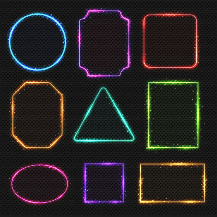
What shape will your call to action button be?
The shape of your button will also play a big role when looking to improve performance. Like colour, different shapes can sometimes evoke different types of emotion. Think about whether it is best for you to choose a rounded button shape or a button with square edges.
If you can’t decide what shape is best, try both. Testing options on your website is a great way to understand what visitors are most attracted to. Don’t be afraid to play around with different shapes to help you understand what works best.
Final Thoughts
Yes, your call to action button is important. You will need to take your time when developing your button. Quality call to action buttons will help to improve your conversion rate and boost your sales. There is a lot that goes into your call to action button. Therefore it is important that you do your research to ensure you have the best button possible.
Your call to action button needs to be in the right location. As well as this, think about the size, colour and shape of your button. Don’t forget about creating negative space around the call to action button to ensure it is clearly seen. Lastly, you should always look to include more than one button on every page!

Read ➡ Negative SEO – Everything You Need To Know

We are a friendly and reliable team that pays detailed attention to your projects and management of your brand. Our team at SEO Shark has a passion for all things online. We constantly innovate using the latest professional techniques and strategies.

